 Ant Design Blazor
Customize Theme
Ant Design allows you to customize our design tokens to satisfy UI diversity from business or brand requirements, including primary color, border radius, border color, etc.
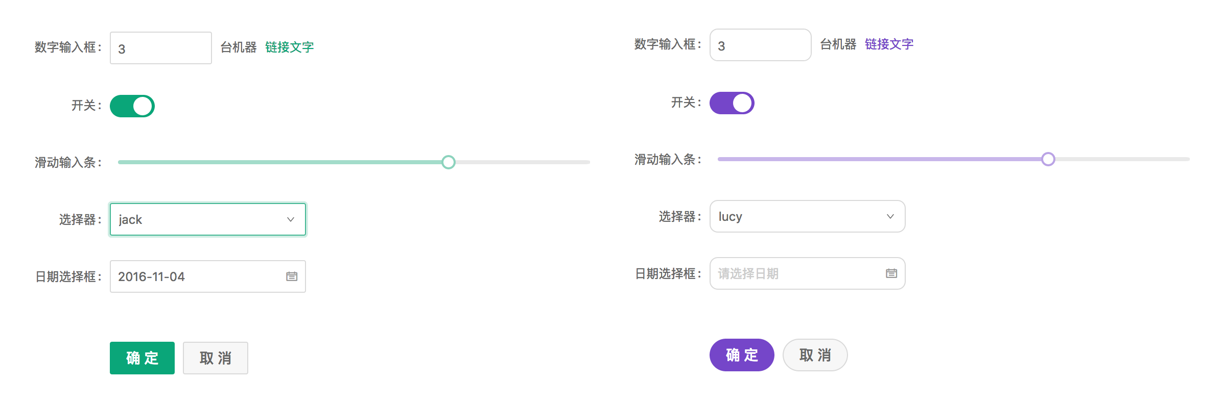
Ant Design Less variables
We are using Less as the development language for styling. A set of less variables are defined for each design aspect that can be customized to your needs.
There are some major variables below, all less variables could be found in Default Variables.
@primary-color: #1890ff; // primary color for all components
@link-color: #1890ff; // link color
@success-color: #52c41a; // success state color
@warning-color: #faad14; // warning state color
@error-color: #f5222d; // error state color
@font-size-base: 14px; // major text font size
@heading-color: rgba(0, 0, 0, 0.85); // heading text color
@text-color: rgba(0, 0, 0, 0.65); // major text color
@text-color-secondary: rgba(0, 0, 0, 0.45); // secondary text color
@disabled-color: rgba(0, 0, 0, 0.25); // disable state color
@border-radius-base: 2px; // major border radius
@border-color-base: #d9d9d9; // major border color
@box-shadow-base: 0 3px 6px -4px rgba(0, 0, 0, 0.12), 0 6px 16px 0 rgba(0, 0, 0, 0.08),
  0 9px 28px 8px rgba(0, 0, 0, 0.05); // major shadow for layers
How to do it
We will use modifyVars provided by less.js to override the default values of the variables, You can use this example as a live playground. We now introduce some popular way to do it depends on different workflow.
Theme Customization Methods
There are two main ways to customize the theme in Ant Design Blazor:
1. Using Gulp Compilation
The project's styles are compiled into CSS using Gulp. You can modify the theme by changing variables during the compilation process.
The AntDesign NuGet package includes all the Less files, which will be generated in the output directory after publishing. For example, if the output directory is publish, the Less files will be located in the publish\wwwroot\_content\AntDesign\less directory. The theme entry file is ant-design-blazor.less.
The following is an example of a Gulp configuration file:
Create a gulp.theme.js file:
const gulp = require("gulp");
const less = require("gulp-less");

gulp.task("theme", function () {
  const lessOptions = {
    modifyVars: {
      "primary-color": "#1DA57A",
      "link-color": "#1DA57A",
      "border-radius-base": "2px",
    },
    javascriptEnabled: true,
  };

  return gulp
    .src(
      "path/to/publish/wwwroot/_content/AntDesign/less/ant-design-blazor.less"
    )
    .pipe(less(lessOptions))
    .pipe(gulp.dest("./wwwroot/css"));
});
You can customize the theme by modifying the values in modifyVars. These variables will override the default values in default.less.
2. Using CSS Variables
Ant Design Blazor provides a CSS variables file (ant-design-blazor.variable.css) that allows you to customize the theme at runtime. This method is more flexible as it doesn't require recompilation.
First, include the CSS variables file in your project:
<link
  href="_content/AntDesign/css/ant-design-blazor.variable.css"
  rel="stylesheet"
/>
Then you can override the CSS variables in your own stylesheet:
:root {
  --ant-primary-color: #1890ff;
  --ant-primary-color-hover: #40a9ff;
  --ant-primary-color-active: #096dd9;
  --ant-primary-color-outline: rgba(24, 144, 255, 0.2);
  --ant-success-color: #52c41a;
  --ant-warning-color: #faad14;
  --ant-error-color: #ff4d4f;
  --ant-font-size-base: 14px;
  --ant-heading-color: rgba(0, 0, 0, 0.85);
  --ant-text-color: rgba(0, 0, 0, 0.65);
  --ant-text-color-secondary: rgba(0, 0, 0, 0.45);
  --ant-disabled-color: rgba(0, 0, 0, 0.25);
  --ant-border-radius-base: 2px;
  --ant-border-color-base: #d9d9d9;
}
You can also change these variables dynamically using JavaScript:
document.documentElement.style.setProperty("--ant-primary-color", "#1DA57A");
This method is particularly useful when you need to:
- Implement dynamic theme switching
- Make runtime theme adjustments
- Support user-customizable themes
Note: The CSS Variables method provides better browser compatibility and easier runtime modifications, while the Gulp compilation method might be preferred for static themes or when you need to support older browsers.
Official Themes 🌈
We provide some official themes, feel free to try them out in your project and give us feedback.

To use the official themes, simply replace the corresponding CSS file:
Default theme: _content/AntDesign/css/ant-design-blazor.css
Dark theme: _content/AntDesign/css/ant-design-blazor.dark.css
Compact theme: _content/AntDesign/css/ant-design-blazor.compact.css
Aliyun theme: _content/AntDesign/css/ant-design-blazor.aliyun.css